Pages

Tuesday, 26 March 2013

Class work: Morphing

In class last week I learned to morph shapes and colours in Flash. Knowing how this process works gives a really good understanding of some of the techniques needed to animate. Knowing how to use shape hints is really useful, as is shape tweening. There were a few complications, in that if the shape hints weren't perfectly positioned the objects got flipped in all sort of weird ways, but as long as they're in the right order it leads to an interesting piece of animation.


Morphing from a purple circle to a yellow square. Placing the shape hints on the top corners ensures the correct orientation of the animation.


Transitioning from a rectangle to an oval to a hexagon, going through several colours in the process.


Friday, 22 March 2013

Flash animation: inverse kinematics and audio

I just did the tutorials on lynda.com for IK and inserting audio into Flash animations. The audio is fairly straightforward; we've done it in a lot of the tutorials with Denise already but it's never any harm to reinforce things. The IK tutorials were great, it's a really good way of putting the life into your animations. It's similar to 3DS max, but a lot less complicated. There's also the option of creating runtime animation, where your user can alter the animation of the finished movie within Flash player, which is really cool, particularly if you want to develop games.

This shows the bone tool in use. You can adjust the positioning of each bone to get realistic movement of joints.

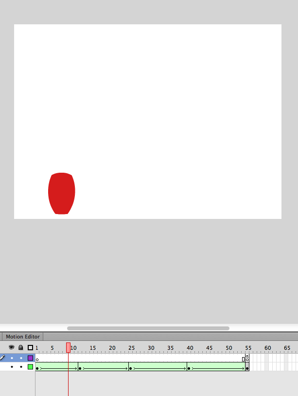
This is the timeline of the animation after it's been converted to frame-by-frame animation so it can be played in older versions of Flash player which don't support IK.

This is a still from a movie where the runtime feature is enabled; I used the mouse to click inside the finished animation and move the monkey.

Another example picture.
 

Friday, 1 March 2013

Redesigning the mobile experience

The assignment given was to redesign your phone to fit your needs perfectly. Now, I have a newish Nokia Lumia 800 and I love it so I found it quite hard to think of ways in which to improve it! I really like the graphic interface - the use of nice geometric squares to organise your information.


I kept this aspect of the design but I changed the orientation of the squares to be diamonds, and I stripped down the interface a little to include only my most used features. I also added texture to the tiles to give the impression they are being indented when you touch them - a little throwback to the day when we all used buttons :) I gave access to connectivity and volume buttons from the home screen because I don't like having to go into my settings to access them.


I then changed the messaging interface; I like the possibility of having my text messages, voice mails and emails all in the same place, so that's what I did.


Finally I redesigned the sleep screen. Like many people, I use my phone as a replacement watch as well, so I placed the time and date prominently on the screen. If there are messages the user hasn't read, a notification appears on the screen. I also added weather and the moon phase, as I'm interested in astronomy and it's never any harm to know when the next full moon in :)


My initial sketches for the project are below: